The Craze for Designer Logos in the 1990s and Early 2000s
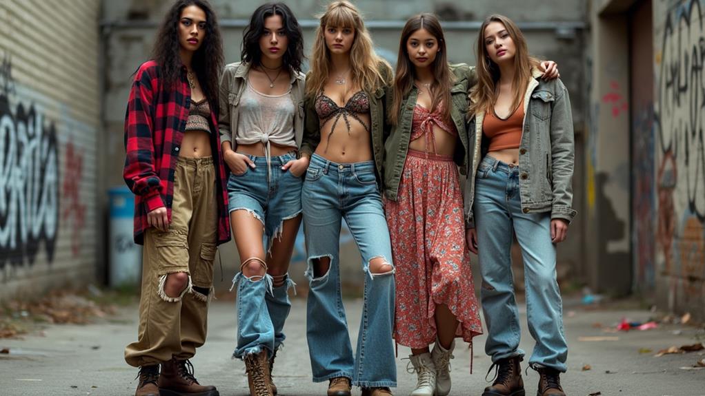
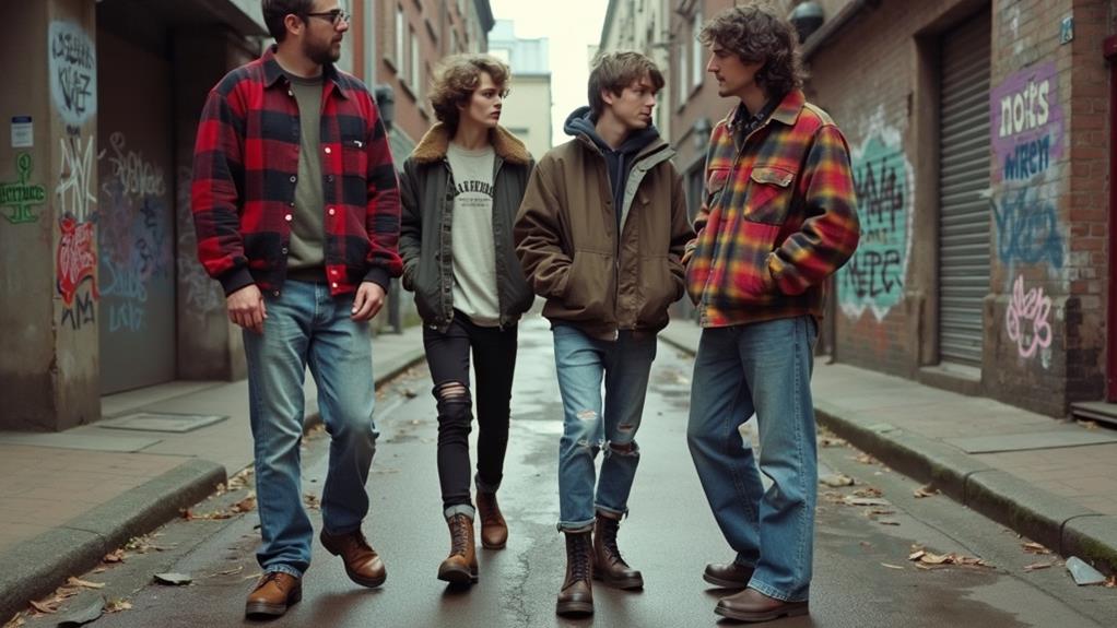
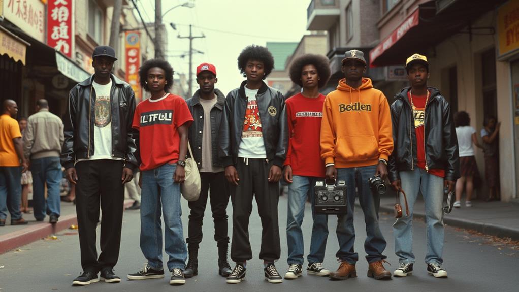
In the 1990s and early 2000s, designer logos were omnipresent, dominating both runways and streets. Celebrity endorsements, particularly from figures like Paris Hilton and Britney Spears, played a pivotal role in setting trends that the masses eagerly followed. High-fashion brands were not merely selling garments but promoting an aspirational lifestyle, strategically spotlighting their logos. This era of logomania was sparked by a blend of cultural influences and key design trends, shaping the interplay between streetwear and luxury fashion. Let's delve into the factors that fueled this iconic craze and its impact on fashion dynamics.
Cultural Influences on Logo Design
The rise of designer logos in the 1990s marked a significant cultural shift, driven by the influential allure of celebrity culture. High-profile endorsements from stars like Paris Hilton and Britney Spears brought logo-centric fashion into the mainstream, making it highly coveted by the public. This movement was significantly influenced by graphic designers who created iconic logos, synonymous with luxury and status.
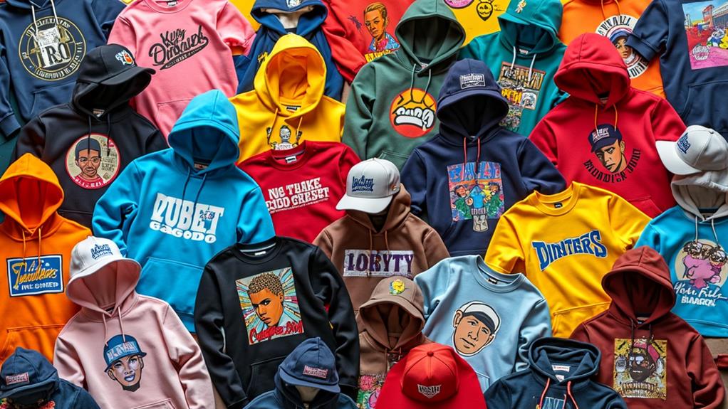
Dapper Dan, a pioneering Black designer, laid the foundation for this trend in the 1980s by ingeniously blending street culture with high-end fashion logos. His innovative designs paved the way for the logomania that defined the 1990s and early 2000s. The 1992 lawsuit against him by Fendi highlighted the tension between street culture and high fashion, further increasing the visibility of logos.
High-fashion houses leveraged this trend by strategically gifting products to celebrities, enhancing brand prestige and shaping consumer behavior. Consequently, the "walking billboard" phenomenon emerged, with designer logos prominently displayed on clothing, reflecting the era's obsession with status and brand recognition. This cultural shift underscored the influential role of graphic designers in shaping fashion trends.
Key Design Trends
During the 1990s and early 2000s, graphic design trends underwent significant shifts that heavily influenced fashion branding. Bold, colorful Memphis design styles, characterized by geometric shapes and lively patterns, became prominent, making fashion logos instantly recognizable and memorable.
Typography innovations were also at the forefront. This period introduced Comic Sans, a font both loved and criticized, and floating 3D text that gave advertisements and album covers a distinct, futuristic feel. Grunge typography, with its chaotic and expressive lettering, mirrored the raw, artistic edge of cultural movements at the time, adding a rebellious flair to brand identities.
The anti-design movement pushed back against traditional aesthetics, emphasizing playful fonts and a DIY ethos. This movement celebrated individuality and creativity, allowing logos to break free from conventional constraints.
As the 90s drew to a close, minimalism began to take hold. Designers favored clarity and simplicity, balancing earlier chaotic experimentation with clean, rational approaches. This shift towards minimalism ensured that logos remained impactful yet easy to recognize, providing fresh design inspiration that carried into the new millennium.
Iconic TV Show Logos
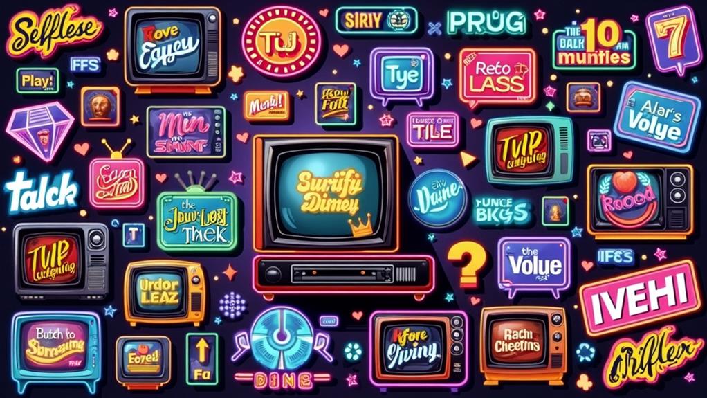
Iconic TV show logos of the 90s and early 2000s embodied the spirit and cultural zeitgeist of their respective eras. These designs weren't just images; they captured the essence of the shows and the times they represented. Let's delve into some standout examples and how they aligned with graphic design trends of the period.
- MTV Logo: Inspired by graffiti art, the MTV logo became a symbol of rebellion and freedom. Its edgy, urban aesthetic epitomized music and youth culture, making it an icon for a generation seeking to defy norms.
- Cartoon Network Logo: Featuring a playful seven-by-two-square grid design with alternating black and white blocks, this logo reflected the fun and energetic nature of the network's programming. It was a masterclass in simplicity and vibrancy, appealing to both kids and nostalgic adults.
- Nickelodeon Logo: Characterized by a bright orange splat and a rounded custom typeface, this logo targeted children aged 6 to 17. It conveyed approachability and cheerfulness, making it instantly recognizable and beloved by its audience.
These logos didn't just represent TV shows; they encapsulated the graphic design trends of their times, creating lasting impressions that still resonate today.
Memorable Candy and Snack Logos
Candy and snack logos from the 90s and early 2000s were more than just packaging decorations; they sparked joy and excitement in kids everywhere. Sweet Tarts' bubbly wordmark, featuring its split-toned "T," visually captured the essence of its sweet and tart flavors. The inclusion of "tangy candy" ensured that the taste experience was unmistakable.
Bubble Tape's logo featured a playful, bubbly typeface in a purple gradient bubble, with an extended "e" wrapping around, symbolizing the endless fun of chewing bubble gum. This design embodied youthfulness and excitement.
Baby Bottle Pop's logo was another standout, using a bubbly neon typeface and a baby bottle cap element. The chalk-like line surrounding the wordmark added a playful touch, making it irresistible to kids.
Fruit Roll-Ups didn't just offer a snack; they offered fun through lively packaging and bold typography. The colorful design captured an adventurous spirit, making it a favorite among children and tweens.
These memorable logos were more than mere designs; they were gateways to the fun and excitement that defined the 90s and early 2000s snacking experience.
Notable Toy and Product Logos

Reflecting on the 90s and early 2000s, many iconic toy and product logos left a lasting impression with their lively and playful designs. Logos such as Hot Wheels' fiery gradients and Barbie's signature hot pink effectively captured the essence of their brands and resonated with their audiences. These colorful visual identities not only stood out on shelves but also played a crucial role in the branding evolution of these beloved products.
Iconic Logo Designs
Embracing lively colors and playful designs, the logos of notable toys and products from the 1990s and early 2000s left an indelible mark on pop culture. Iconic logo designs like Hot Wheels, Barbie, and Toys R Us didn't just represent brands; they became symbols of childhood joy and excitement.
- Hot Wheels: The vibrant red and yellow-orange flame logo, paired with a dynamic custom font introduced in the 1990s, captured the brand's energetic spirit, making every toy car feel like it was racing off the shelves.
- Barbie: The consistent hot pink logo, featuring a bold custom font, exuded femininity and aspiration. The angular and curved edges of the font embodied positivity, making it a beloved symbol for generations of young girls.
- Toys R Us: The playful, colorful logo with a backward "R" mimicking a child's handwriting resonated deeply with children and families. It became synonymous with fun and the joy of discovering new toys.
Additionally, the Tamagotchi's child-like scrawled typeface in hot pink and the Baby Bottle Pop's bubbly neon design stand out as memorable icons. These logos didn't just adorn products; they encapsulated the essence of a time defined by creativity and fun.
Branding Evolution Impact
The iconic logo designs of the 1990s and early 2000s were not merely focused on aesthetics; they played a crucial role in shaping brand identity and influencing consumer perception. The branding evolution impact is evident in the logos of notable toys and products from that era.
The Hot Wheels logo, with its dynamic red and yellow-orange flame design and custom font, captivated young automotive enthusiasts. Its distinctive graphic elements made it instantly recognizable and exciting.
Since 1959, Barbie's logo has consistently employed a hot pink hue with a bold custom font featuring angular and curved edges. This design effectively communicated femininity and resonated deeply with its target demographic.
The playful and colorful Toys R Us logo, with its backward "R" mimicking children's writing, enhanced its authenticity and connection to the joy of childhood.
The Tamagotchi logo's scrawled typeface, mixing lowercase and uppercase letters, captured the playful spirit of digital pets during the 90s. Similarly, the ICQ logo evolved to include a simple rounded sans-serif font and a flower symbol, with the red petal indicating chat notifications—marking a significant development in branding for early instant messaging services.
| Brand | Logo Characteristics |
|---|---|
| Hot Wheels | Lively flames, custom font, horizontal gradient |
| Barbie | Hot pink hue, bold custom font, angular and curved edges |
| Toys R Us | Colorful, playful design, backward "R" |
| Tamagotchi | Scrawled typeface, mix of lowercase and uppercase letters |
| ICQ | Rounded sans-serif font, flower symbol, red petal for notifications |
Colorful Visual Identity
Regarding colorful visual identities, the logos of notable toys and products from the 1990s and early 2000s didn't just catch the eye; they made a lasting impression. These logos became ingrained in pop culture, thanks to their lively colors and playful designs.
- The Hot Wheels logo, with its fiery red and yellow-orange hues, instantly conveyed speed and excitement, perfect for its toy car audience. Those flames evoked thrilling races and daring stunts.
- Barbie's hot pink logo has been iconic since 1959, but during the 90s and early 2000s, it truly stood out. The bold, custom font and upward slant signified positivity and aspiration, resonating deeply with young girls dreaming big.
- The Toys R Us logo, featuring the playful backward "R," was a staple in any child's mind. Its colorful letters and child-like design made it instantly recognizable and synonymous with fun.
Other notable logos from this timeframe include Tamagotchi and Baby Bottle Pop. Tamagotchi's scrawled typeface and hot pink letters created a sense of excitement, while Baby Bottle Pop's bubbly neon typeface and playful imagery aligned perfectly with its fun, novelty-driven marketing. These logos didn't just represent products; they captured the essence of a generation's fun and imagination.
Technological Advancements
Graphic design software like Adobe Photoshop, launched in 1990, revolutionized how designers created logos and branding materials throughout the 1990s and early 2000s. It introduced powerful tools that transformed workflow and enhanced capabilities. The technological advancements did not stop there. Vector-based software such as Adobe Illustrator enabled scalable logo designs, ensuring consistent quality across various media formats—crucial for improving brand visibility.
Advancements also extended to printing technologies. Digital printing allowed brands to produce high-quality logo merchandise more efficiently and cost-effectively, eliminating the high costs and long lead times associated with traditional printing methods.
Additionally, the late 1990s saw the rise of the internet, which facilitated the rapid spread of logo-centric branding through e-commerce platforms. This enabled companies to reach a global audience, making their logos recognizable worldwide.
Here's a summary of these technological changes:
| Technology | Benefit | Impact on Branding |
|---|---|---|
| Adobe Photoshop | Enhanced design capabilities | More intricate logos |
| Adobe Illustrator | Scalable designs | Consistent quality across media |
| Digital Printing | Efficient, cost-effective | High-quality merchandise |
| Internet | Broader audience reach | Global brand recognition |
| Computer Graphics | Dynamic advertising campaigns | Visually engaging logos |
These advancements set new standards for brand identity and recognition, making logos more dynamic and visually engaging.
The Anti-Digital Movement
In the late 1990s, a shift toward the anti-digital movement emerged, with designers embracing handcraft and a D.I.Y. design sensibility. Publications like "Handwritten" and "New Vintage Type" inspired many to prioritize physical engagement and traditional techniques. This era, often referred to as "The Decade of Dirty Design," celebrated the authenticity and imperfection of handmade work over the polished look of digital design.
Return to Handcraft
The late 1990s to mid-2000s witnessed a vibrant resurgence in handcrafted design, marking a significant shift from the increasingly prevalent electronic methods. This period embraced tactile design, focusing on physical engagement with materials as a reaction against digital dominance. Publications like "Handwritten," "New Vintage Type," and "New Ornamental Type" celebrated the value of hand-generated content and traditional techniques, encouraging designers to reconnect with the artistry of the past.
This shift was also reflected in educational trends, as design curricula began to emphasize hand typesetting and letterpress printing. Workshops emerged, teaching skills in painting, carving, and manual printing. This resurgence extended into professional practices, inspiring designers to blend traditional craftsmanship with modern electronic tools.
Imagine the scene:
- Ink-stained hands from letterpress workshops, where each print carries the unique imperfections of the handcrafted process.
- Wooden type blocks carefully carved, embodying a tangible connection to the designer's touch.
- Hand-painted signs and illustrations, each stroke telling a story of dedication and skill.
This "Decade of Dirty Design" underscored the enduring value of craftsmanship, raising questions about the future of design mediums in our electronic era.
D.I.Y. Design Sensibility
In the late 1990s, as digital technology advanced, a counter-movement known as the D.I.Y. design sensibility emerged, rejecting the impersonal nature of digital design. This movement emphasized a return to handcrafted techniques and physical engagement with materials, showcasing a raw, authentic aesthetic. Publications like "Handwritten," "New Vintage Type," and "New Ornamental Type" championed this anti-digital ethos, celebrating traditional design methods and hand-generated content.
Educational institutions took note, incorporating hand typesetting and letterpress printing into their curricula. This wasn't merely about nostalgia; it was a deliberate effort to preserve tactile design skills for new generations of designers. Community workshops became hubs for collaboration, offering skills in painting, carving, and hand printing. These workshops fostered a renewed appreciation for craftsmanship, creating a vibrant, collaborative design community.
Ironically, the rise of social media helped spread the D.I.Y. design sensibility, allowing designers to share their handcrafted works widely. Dubbed "The Decade of Dirty Design," this movement challenged polished digital aesthetics by blending traditional craftsmanship with contemporary practices, leaving an enduring legacy.